One of our long-time restaurant clients, John Sheehan of Doolittles Woodfire Grill and Porter Creek Hardwood Grill, suggested that I address the topic of space. John asked several questions. To answer them adequately will certainly require more than one article. Here’s what he wrote me:
“If you wanted one thought right out of the gate, I would suggest you write about space! No … not outer space … inner space like in our restaurants! I think most restaurant operators would be fairly clueless about dining space. Talk about the relationship of spaces — such as at the table, walkways, and the distance between people at the tables, etc., which all give a feel for how enjoyable the dining experience will be. Talk about your feelings about visual space – how much you see going on around you vs. at your table as compared with the central theme of the concept. … ”
His questions have prompted me to address two principles related to space design: “No bad seats” and “Tighter can be better.”
When I design a restaurant, I try to imagine what it is like to sit in every seat in the house. “No bad seats” is the goal. Much is made of visualization in the sports world. We often hear about or see skiers visualizing a run down the slalom course or a skater moving through the next performance. This visualization approach works in restaurant design, as well.
There will be different experiences depending on where you sit and what your mood is. On certain occasions, you will be attracted to some areas of the restaurant more than others. It is certainly OK to create quieter “observatory” spaces while at the same time create ones located in the heart of the action.
I try to think about the height of the seat relative to the room. What is the ceiling height? Can you see who is coming in the front door? What is your eye level relative to the neighboring tables? If the booth is near the traffic at the kitchen entrance, what can be done to make it a great seat?
In our practice we work on many restaurant and foodservice concepts. They range from small neighborhood delis to large country club fine–dining rooms. The spatial relationship of tables to rooms is always a factor in the success of the concept.
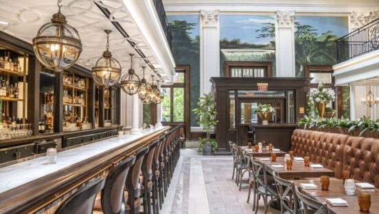
So many restaurant owners plan the spatial relationships for the servers and for efficiency, and often overlook the impact that relationship will have on the guest. Nice wide aisles allow the server to get the food to the guest more quickly and therefore more efficiently. Alternatively, nice wide aisles, more often than not, have a negative effect for the guest — loneliness; separate, not part of the crowd; and removed from the action.
If your goal is to produce an energetic, happening environment that is the place to be and be seen, then make it tight. I am in favor of close proximity of table to table or table to bar top. This doesn’t mean that once your guests are seated, they are squished together. We want the guests to be comfortable in a way that is suitable to the restaurant concept, but we also want them to feel a part of the action.
Believe it or not, budget really isn’t a factor when it comes to the layout of a restaurant. No matter whether you have a generous budget or a tight one; the principles of space design apply. No dead ends and no bad seats.
As we all know, the building codes influence much of what we do. While sometimes that is a challenge, it is equally interesting and can be exciting to find ways to meet the letter of the law and spirit of the code, and yet still create a dynamic space that works for all. We decidedly want to provide a safe environment for the guests and employees, to allow access for emergency egress, and to accommodate those with physical disabilities.
This idea of a tight space leading to success became very evident after the opening of the first Redstone American Grill in Minnetonka, Minn. When we were introduced to the site, it broke all the rules of a great location. The building, about 30 years old, used to house a suburban bank. It was a brick monolith with very few windows except at the drive-thru. Even worse was the location, which was behind the large regional shopping mall called Ridgedale, completely hidden from the main freeway. One positive thing it did have, however, was the ability to add parking.
A significant bar presence was determined to be important. The design also needed to be focused on the display cooking line. During the design process, when we visited restaurants around the country and tried on numerous schemes, it became evident that the bar should be right down the middle of the restaurant. The existing columns, however, only allowed 4.5 feet between the bar top and the row of columns that defined the booth seating across from the bar.
This 4.5–foot dimension was about a foot less than what we had used typically, and very tight when you add the barstool and people standing at the bar and the booths behind. But, for this concept, that is where the bar needed to be. We also surrounded the bar with booths on both sides and raised 8 inches. Surrounding those booths was more booths raised another foot, accessible by stairs and sloping aisles, focused on the bar and the display cooking beyond. Well, as it turned out, people loved the space and continue to jam in around the bar, elbow to elbow even today, after 12 years of operation. Of course, No. 1, the food is great and the service, exceptional.
Who are you? Who is your clientele? What is your food concept? No bad seats?